

Why Paper-Like Interfaces Feel Calm and Premium
 Demo Admin
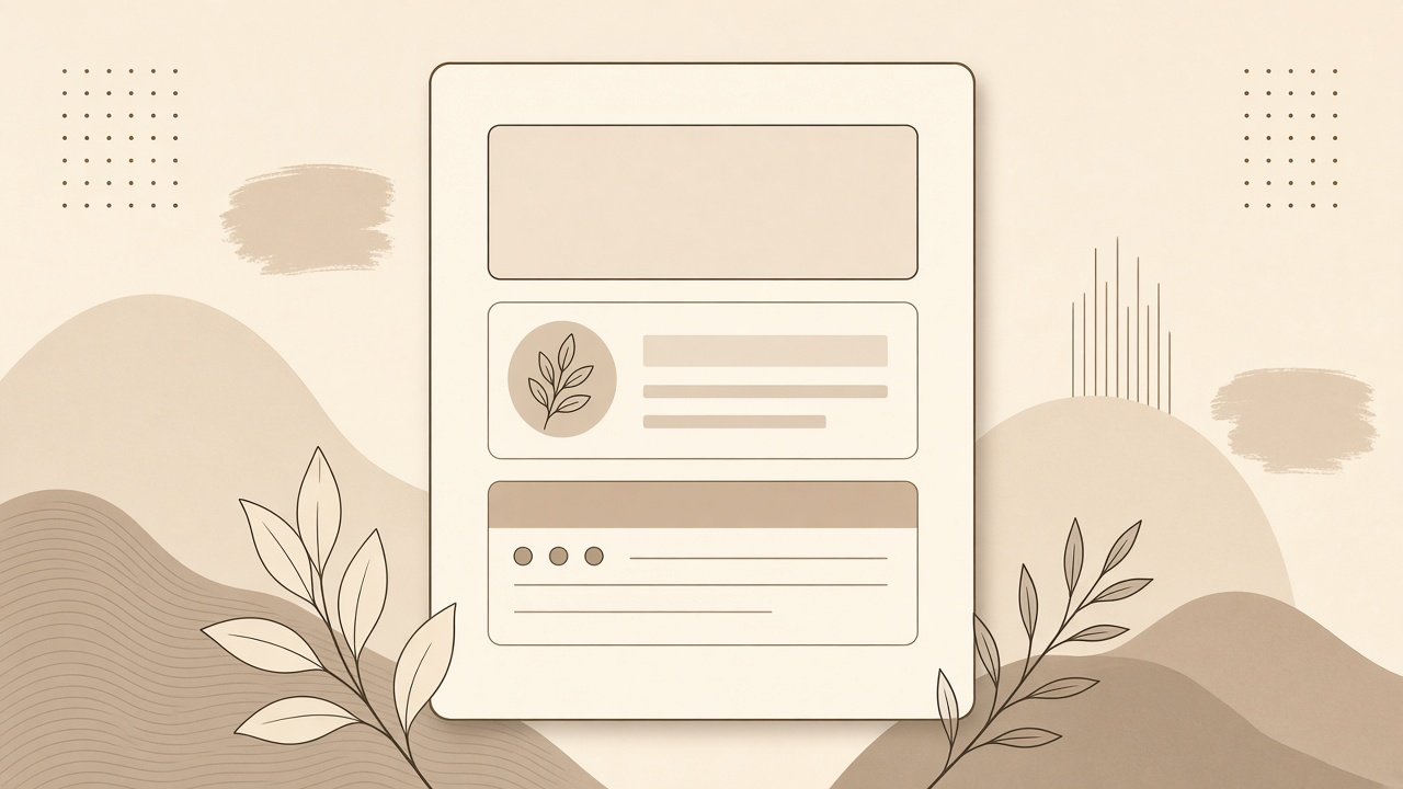
Paper-like interfaces feel premium because they borrow the discipline of print. They rely on hierarchy, spacing, and contrast instead of spectacle. That restraint reads as confidence.
In a web full of glow effects and overworked gradients, a quieter surface can feel surprisingly fresh. Not because it is nostalgic, but because it is easier to trust.
What “paper-like” really means
It does not mean scanning notebook textures onto every background. It means treating the interface like a well-set page: clear reading order, honest edges, limited decoration, and enough room for content to breathe.
- Warm neutrals reduce visual fatigue.
- Strong ink contrast improves readability.
- Borders can replace heavy shadows.
- Spacing creates structure without extra chrome.
Why calm feels expensive
Busy interfaces often signal uncertainty. They add emphasis everywhere, which eventually emphasizes nothing. Calm interfaces choose a few signals and protect them.
That selectivity feels premium because it suggests care. Someone decided what mattered and removed the rest.
The role of texture and tone
Soft paper tones create warmth without demanding attention. When paired with dark text and simple rules, the result feels tactile and composed rather than sterile.
Premium is often the absence of unnecessary competition on the screen.
Where this approach helps products
Image hosting, documentation, portfolios, and content-heavy tools benefit especially from paper-like calm. People come to view work, read details, or complete a task. The interface should support that, not audition for attention.
A restrained visual system also scales better. New pages inherit the same quiet logic instead of inventing new effects each time.
Applying the idea without becoming bland
Calm design is not the absence of personality. It is personality expressed through structure, type, tone, and a few carefully chosen accents. You can still have warmth, character, and brand presence without flooding the interface with effects.
Use accent color sparingly. Let imagery and content provide richness. Allow the shell of the product to stay composed so the work inside it can stand out.
A practical UI checklist
- Can the page be understood in grayscale hierarchy alone?
- Are borders and spacing doing more work than shadows?
- Is every accent color earning its place?
- Does the interface stay quiet when content is dense?
If the answer is yes to most of those, you are probably closer to a paper-like premium feel than any texture overlay could take you.
Closing thought
If an interface can stay clear with fewer tricks, it usually should. Paper-like design is not minimal for fashion. It is minimal for comprehension, and that is why it feels refined.
Comments (0)
No comments available
Login or create account to leave comments